[Insider 55] Changing how I see...
exciting adventures with a new sketchbook
Dear Insider,
I am not satisfied with the word sketchbook. It contains the word sketch which is also problematic. It suggests something underdeveloped, something incomplete. It suggests an idea but raw, a long way from execution.
That is not how I use a sketchbook. In today’s post, I want to share the role of sketchbooks in SneakyArt, and a new adventure I started this week.
The SneakyArt (Insider) Post is written for SneakyArt Insiders. It provides a behind-the-scenes perspective on my work as an artist, writer, and podcaster.
If you like receiving SneakyArt in your inbox, share this publication with others and help me reach more people.
🗣 Pose a Question
Insiders get the special opportunity to pose questions for upcoming guests on the SneakyArt Podcast. This month’s recordings are with -
Samantha Dion Baker, graphic designer turned illustrator, author of Draw your Day and Draw your World.
Amy Stewart, urban-sketcher and bestselling author of books such as The Drunken Botanist, Wicked Plants, and Girl waits with Gun.
Sunil Shinde, urban sketcher, traveller, and author of From Cairo to Beirut: In the footsteps of an 1839 Expedition through the Holy Land.
John Muir Laws, artist, educator, and principal leader of the nature journaling movement.
Submit your best questions in the comments!
🙌🏽 The Sketchbook as Frame
I change both the size and format of my sketchbooks after every use. Below are the ones I have used this year.
A landscape-oriented page (longer than it is tall) compels me to follow the lay of the land. The stage is wide, so I often have multiple subjects in the foreground.
A landscape scene is typically ‘read’ left to right, so the defining lines of such scenes are also horizontal.
A portrait-orientation sketchbook pushes me to pick a specific foreground subject. In the scene above, my subject might have been just the lamp post!
Such pages are typically read top to bottom, allowing them to go deeper. The subject is thus contrasted against their own background (or environment).
Here’s a more pragmatic difference between them - in portrait orientation, it is easier to draw standing up. In landscape format, I need to sit down to make sure my long horizontal lines stay true to perspective.
Also, it really matters how the sketchbook fits in your hand!
If you spend a lot of time depicting your world in the pages of a sketchbook, soon enough you start to see through those pages. Page size and orientation determine both what I notice and how I use them to compose the scene.
🔍 Sketchbook as Filter
Earlier this week, I started using a beige-tone sketchbook and it marks a subtle shift in how I approach any scene. To illustrate, let us put it in context.
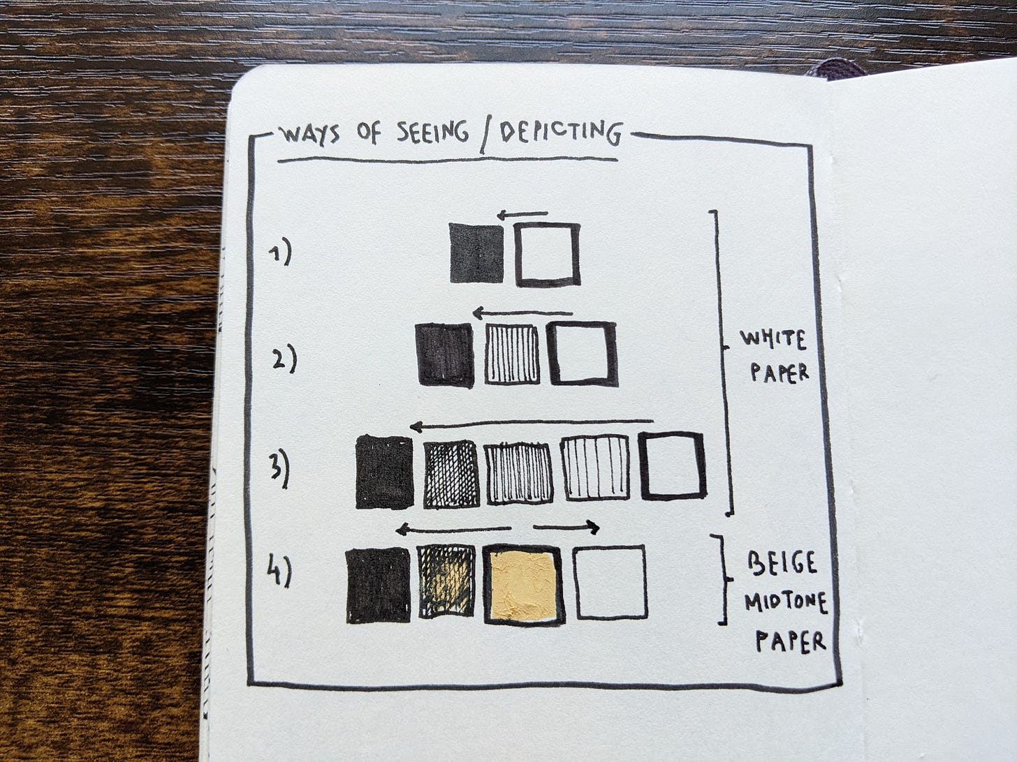
In (1) below, the page is white or blank. Think of it as infinity. My job is to add black lines that mark the edges of objects.
In (2), the black-white spectrum is expanded to include shadow. Think of this shadow as light becoming dark, or darkness giving way to light.
In (3), the spectrum expands further. Hatching and cross-hatching create gradations of darkness. This is where I was at the end of last week.
In every case above, I went from light (the blank page) to dark.
In (4), we see that beige is not at the end of the spectrum. It sits somewhere between pure light and pitch-dark. With my fountain pen (for black) and a gelly roll pen (for white), I go both left and right on the spectrum.
This changes everything.
If the white page represents infinity, every mark on it is a finite reality given form. The black line is the edge of reality, closing around recognizable shapes and forms.
In this black-and-white world, what does that make the beige, mid-tone paper?
Infinite but real, finite but formless, it is like the earth - the medium upon which light and shadow dance with each other.
🤷🏽♂️ But why change sketchbooks at all?
🗓 Because one month (or two) is long enough to see things only one way.
🎯 Because the artist should always challenge their interpretation of reality.
🚦 Because it is good to step outside one’s comfort zone.
Dear Insider, can you think of other good reasons?
🔁 Feedback
I am seeking your feedback on my field recording with Ellen Vesters. If you have not heard it yet, visit the link below.
Depending on how it is received, I will do more recordings whenever I go sketching with other people.
Thank you, dear Insider, for your kind support of my work. I am glad to have a space in your inbox, and a share of your time and attention every week.


I think I see another difference with using toned paper. The white paper sketches tend to look more flat. Looking at the toned coffee shop, the rounded pillar being the barista and the coffee cup on your table, are more dimensional due to the white and black showing more contrast of sun and shadow. Do you notice a difference in that way?
I think most of us love buying new stationary.. and the stash usually has a sketchbook or three.. in addition to the reasons you have listed, using one of them(from the stash) creates an opportunity to go out and buy a new one guilt-free :D