Today's subject is a tangent from early in the conversation with Marc Taro Holmes in Ep 23. We were talking about the videogame industry of the 90s. I am going to talk about a couple of games I have played, share some remarkable features, and leave you with three useful ideas for an artist and visual learner.
Subscription content is bonus content made possible by the generous support of my top readers. It goes out every week. Here’s what I offer -
📕 SneakyArt of Vancouver - Read passages from my next book as it is written.
🎙 *NEW* SneakyArt PostScripts - Listen to post-conversation banter with my podcast guests, like a second podcast!
🗣 Bonus Commentaries - Go down rabbit-holes from interesting tangents of my podcast conversations.
🎁 Giveaways - Enter raffles for SneakyArt prints and workshop discounts
🎨 Art Talk - Read about the process of my on-location art and commissioned work
Hello and welcome to the SneakyArt (Insider) Podcast.
This episode is what I like to call a bonus commentary. You can choose to just read, but I elaborate upon some points in the audio so it’s definitely worth a listen.
🕹 What a game is about
Every game is a world of its own. There are rules and rewards, things you should do and things you cannot do. How vested you are in the game is the degree to which that world becomes real for you. And this has nothing to do with how realistic the game is - it applies to Call of Duty and Super Mario, equally.
Marc and I were talking about how in the 90s, every few months, hardware technology took giant strides forward. This led to a parallel improvement in software, including the software to design better games. The wide gap between reality and graphics was filled by imagination in the 90s, but that gap was fast closing.
Every upgrade in hardware caused a boom in new software, and new ideas, making games more realistic.
But why talk about old video-games?
Today's gaming scene shares interesting parallels with these old games. Today it is not just about big games running on powerful devices. For various reason, a chunk of the gaming industry has moved away from the straightforward pursuit of realism. Here are a few reasons off the top of my head -
Small screens make detailed renderings impossible, and also less useful.
Touch-screen games need to be intuitive and simple.
The potential gaming market is literally every person with a smart device.
👨🏫 Art and Lessons
The new spate of games have a lot of lessons for artists. I want to talk to you about a couple of them, with respect to the art I've seen and the lessons I've learned.
The first game is called Monument Valley.
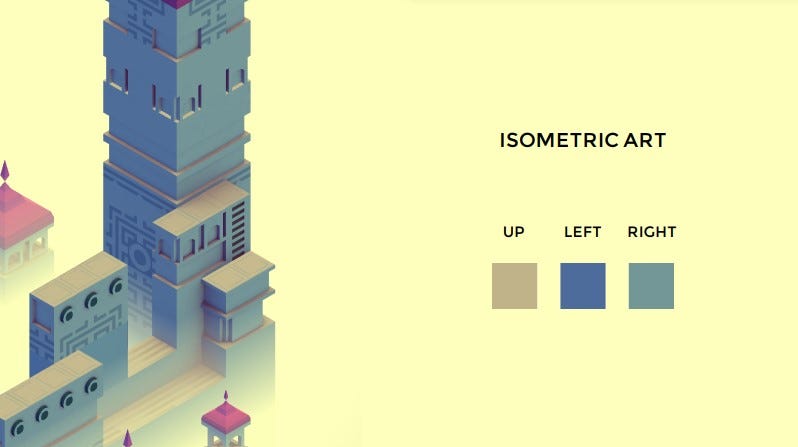
Monument Valley (as featured on the show ‘House of Cards’) is set in a fantastical landscape of impossible geometry and mind-bending architecture. Your task is to move Ida, your character, across the screen, navigating the building or structure, decoding the optical illusions built into them.
The beauty of the game invites you to appreciate the design, and the way to play the game is to appreciate and look through the design's optical illusions.
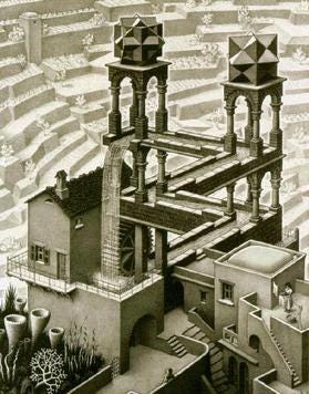
It took inspiration from the impossible geometries of the artist MC Escher, and his mathematician friend Sir Roger Penrose.
As a big fan of MC Escher, I was immediately attracted to Monument Valley. I watched a keynote address by the game's creator Ken Wong, where he explains the different principles and influences in detail.
A second game I have enjoyed is called Mini Motorways - where you design road networks in fictionalized versions of famous cities around the world.
You see, that gap between reality and graphics has become irrelevant now. Once again, it is about investment and imagination.
I took specific lessons from these games. Here are my top three ideas -
Isometric color schemes - Three colors for the three faces of a structure visible to us - up, left, and right. Can we use such ideas to strip down the world we observe? I'm trying to go back to working with watercolors, and it has been a good idea to unpack what I see in this manner.
Also for someone who does not understand color schemes very well, game-screenshots have worked as excellent references.
Minimalism - I like the idea that we can make something beautiful and richly detailed, just by steadily adding simple elements one on top of the other. Also, minimalism invites us to focus on what is important, and use the surrounding scenery for … well, scenery.
For example, observe the trees and water-bodies below.
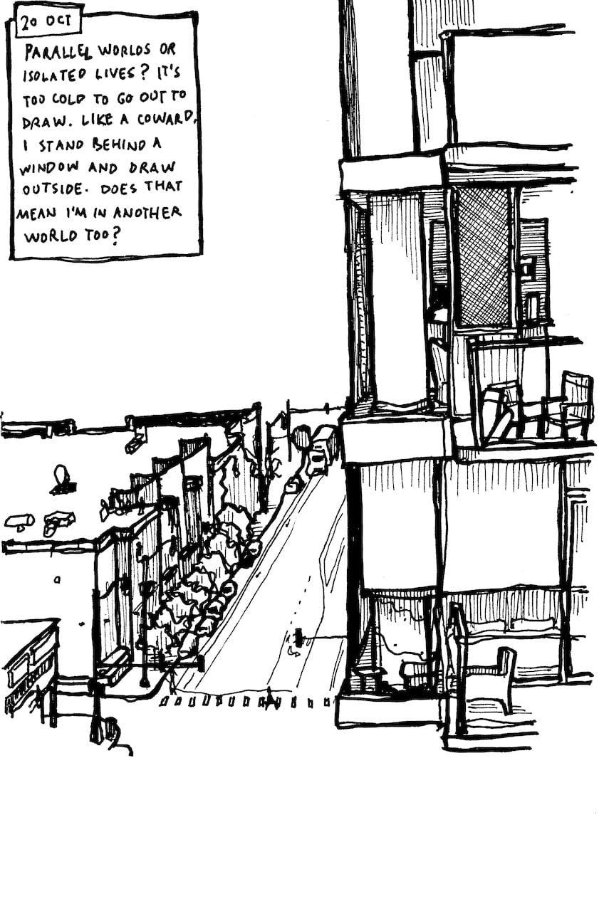
Application - My biggest takeaway was with respect to the application of Escher’s art in Monument Valley. I used to see Escher's work and the Penrose Triangle simply as they were, but Monument Valley laid out a practical way for them to be implemented in one’s work. It made me think, can I draw a Penrose Triangle from real-life observation? An attempt below.
Escher illustrated mathematical concepts in amazing, ways without being a mathematician himself. I wrote about his ideas of infinity and fractal geometry in the first two issues of the SneakyArt Post - here and here. I have more to say about him, and am excited to go into that another time, with another episode.
🙋♂️ Question for you
Have you taken artistic inspiration from unconventional sources? What was it and how did it help you?
That’s all from this first bonus issue. I’m going to make more commentaries for current and upcoming episodes, and also revisit some older conversations. In the next issue, I will have some art for you, and a little story to go with it. I think you will like it.
Thank you for your time and attention. See you again soon!


